Top 10 Kitchen Trends of 2018
DESIGN TRENDS by SUZANNE DERUSHA – MEDALLION’S DESIGN & TRENDS EXPERT DECEMBER 18, 2018
Read the original post on Medallion Cabinetry Blog.
About this time last year, I was researching forecasts on what trends would look like for 2018. As you know it’s always exciting to see what’s coming in the new year, but the funny thing is, there’s not really a hard stop and start between the trends on a calendar basis. Instead, what we see is a flow that carries through, with slight nuances that change the landscape year over year. So before we get into what 2019 will bring, let’s take a look back at what’s been at the top of trends in 2018.
1. CURATED DESIGN STYLES
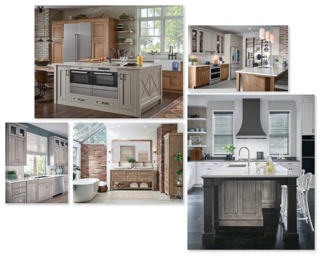
The latest trends are pushing the envelope for mixing unexpected styles, textures, materials and design themes. It’s less about everything matching, and more about having something unique and personalized. Styles like Farmhouse, which started out as a theme of mix & match, upcycling and repurposing, has become commonplace even mixed with Contemporary design themes.
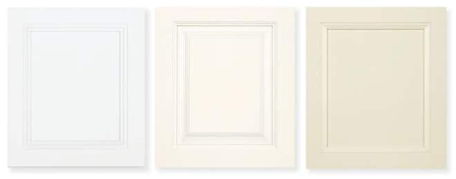
2. WHITE IS STILL WINNING!
Shocking I know – but yes, white is still the top cabinetry pick for kitchens and baths. Whether it’s the timeless, classic appeal or the fact that it gives homeowners that bright fresh space they dream of, the truth is in the numbers and white painted cabinetry remains at the top of the list for 2018 and the foreseeable future!
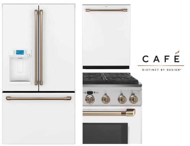
3. IN SYNC WITH TECHNOLOGY
From Alexa to the oven, to the Keurig in the door of a refrigerator, appliances and technology are working hand in hand to bring the kitchen into the future. Not only do we get to enjoy voice commands and app activated essentials that help us out with our busy lives, but finishes are continuing to expand into far more interesting combinations. One of my favorites is from the Café series, where matte white is complemented by brushed bronze. There’s that key term again: personal!
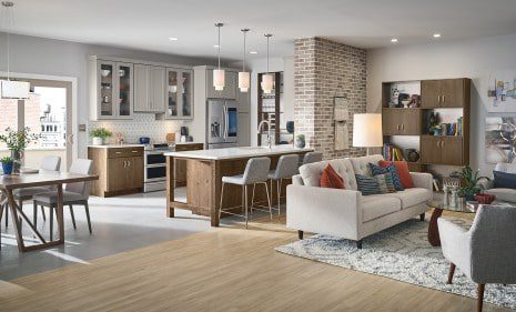
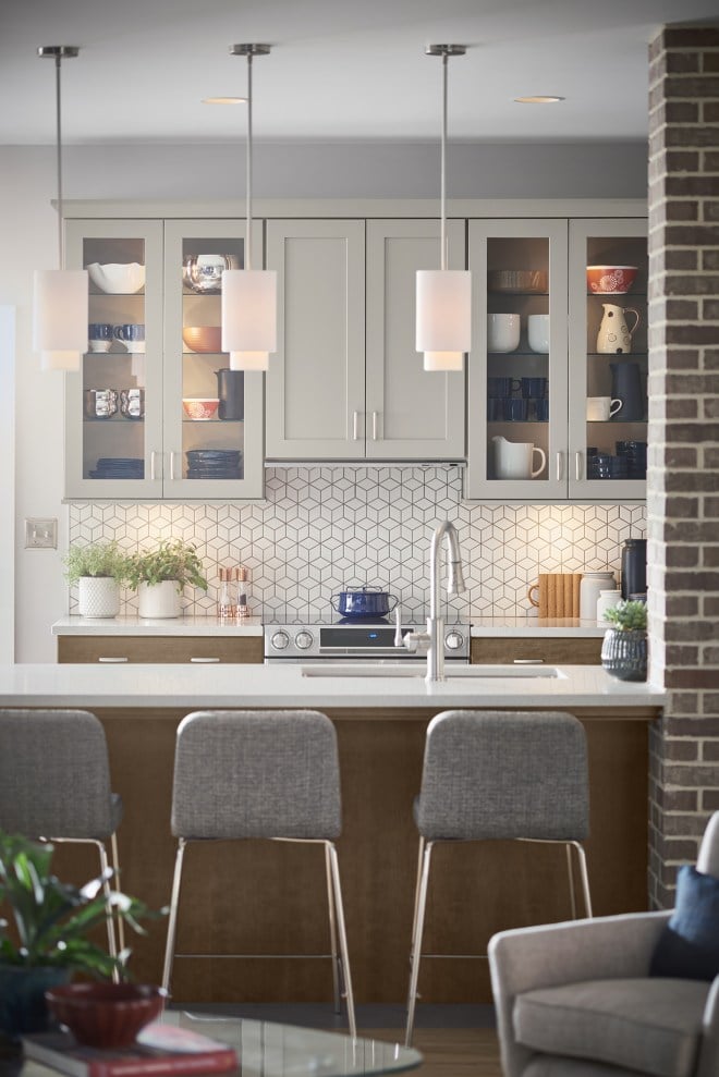
4. BRIGHTER IS BETTER
Tied to the theme of white cabinetry and upscale white appliances, the demand for bright kitchens is reflected in several design compositions:
A) The kitchen should have an open layout that is socially connected to adjacent living spaces
B) Wall cabinetry is exchanged for open shelving
C) Small over-the-sink windows are expanding to often times double or more in width and extending to the countertop for maximized daylight flow
5. DID I MENTION THAT BRIGHTER IS BETTER?
There’s the design and layout side of things, then there’s the light! The past few years have brought dramatic changes to the lighting scene within the kitchen and bath. Under-cabinet lighting still leads the charge, but lately, motion activated interior lighting is the biggest hit. Fashion fixtures, layered, dimmable, integrated and ambient are all part of the conversation with consumers and lighting in today’s kitchen.
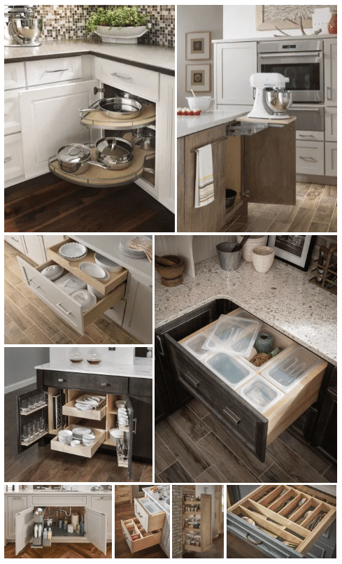
6. ESSENTIALLY DECLUTTERED
Today’s consumer is enamored by DIY TV and all those who are binge-watching the Fixer-Uppers, Property Brothers, Flip or Flops, etc. know that the final reveal is always picture perfect. Well, that leads people to believe they too can have a home, and a kitchen, like that! Today’s consumers want decluttered counters with tailored solutions to keep it that way! From massive Euro-pull-out corners to petite spice storage, to bins for drawers, the list keeps growing for specialty storage in an “I’ve got to have it” kind of way!
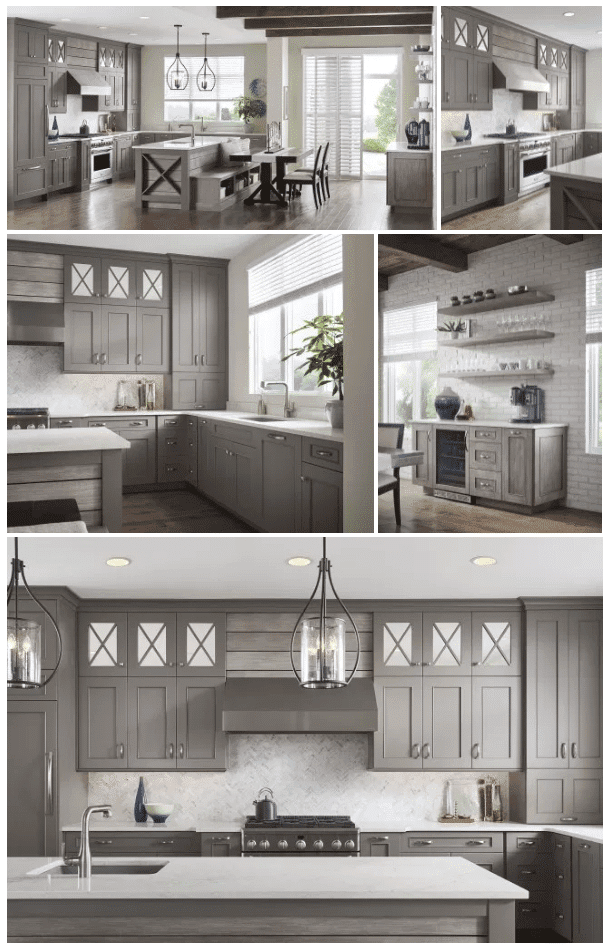
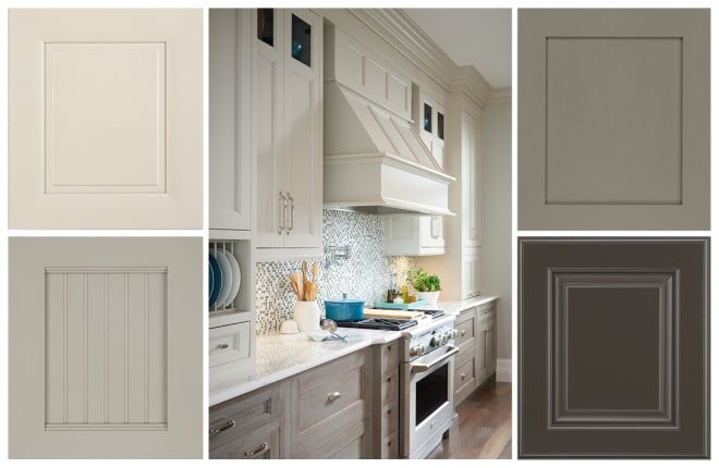
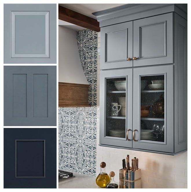
7. NEUTRAL GROUND
While white is a neutral option, the growth in greys continues to have an impact on the overall picture. It’s neutral, and in lighter shades is a great selection for those who like the look of white, but desire something a bit more interesting. Mid-tone greys add a subtle degree of sophistication, while darker tones add bold drama.
8. COLOR IS A-POPPIN’!
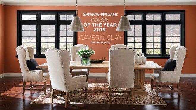
After several years of paint companies introducing whites, greys, and beiges as their “Color of the Year” rule, we’ve seen a dramatic shift – and a growing call for – bringing color into the home. I am so happy to see the change and am quite fond of the blues in particular. There’s just so much emotion and connection to blues– it’s relatable to nature and soothing to the eye.
Alongside blues, we are seeing pops of other nature-inspired hues, like greens and new to the interior palette, the highly controversial Cavern Clay by Sherwin Williams!
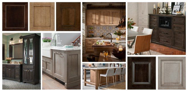
9. THE STATE OF STAINS
White and grey paints have made their mark, but subtly in the background, stains have been shifting away from orange/amber brown tones to hues that dial the intensity back a bit. Starting with the Cappuccino and Peppercorn duo of tones introduced 7 and 10 years ago, we’ve closely aligned with current finishes found in many popular furniture brands to make homes even more welcoming and ensure they reflect the personalities of those who live in them.
10. OUT WITH THE OLD
And in with the Transitional! As a design theme that is always evolving, this particular style continues to take over the Traditional category and to me is becoming, today’s traditional! It embraces the elegant lines of classic details and marries it with wide framed doors and linear contemporary compositions to bring together something very special, a place that Goldilocks would surely say is “just right!”